


In the world of quality control, understanding how a process or product is performing is key to making informed decisions and improvements. One of the most valuable tools in this area is the Histogram. This simple yet powerful tool allows organizations to visualize and analyze data distribution, identify trends, and spot potential issues before they become larger problems.
In this blog, we’ll explore the power of histograms in quality control, how they work, their benefits, and how to effectively use them to improve your quality management processes.
What is a Histogram?
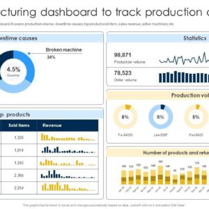
A Histogram is a type of bar chart that represents the distribution of numerical data. It organizes data points into ranges (or bins) and shows the frequency of data points within each range. Unlike a bar chart, which represents individual categories, a histogram groups data into continuous intervals, allowing you to see the underlying distribution.
For example, in a quality control setting, a histogram could display how frequently certain measurements (like product weight, temperature, or dimensions) fall within specific ranges. This visualization provides insight into how consistently a process is performing, whether it’s within the desired specifications, and where variations might exist.
Why Use Histograms in Quality Control?
Histograms are an essential tool in quality control for several reasons:
-
Visual Representation of Data Distribution: A histogram provides an easy-to-understand visual representation of data, allowing you to quickly identify the shape of the distribution and any deviations from expected values.
-
Spotting Trends and Patterns: By analyzing the distribution, you can spot trends over time, such as shifts in the process or patterns that could indicate issues like machine wear, operator inconsistencies, or material defects.
-
Identifying Variability: Variability is a natural part of any process, but excessive variability can signal a problem. Histograms help you analyze whether the process is producing results within acceptable limits or if further improvements are needed.
-
Root Cause Analysis: A histogram can help identify potential root causes of quality issues by showing whether a problem is caused by a specific range of values or a broader issue in the process.
-
Data-Driven Decisions: Histograms allow quality control teams to make informed decisions based on actual data, reducing the reliance on guesswork or subjective opinions.
Key Components of a Histogram
To fully understand the power of histograms, it’s important to know their key components:
-
X-Axis (Horizontal Axis): Represents the data values or measurements that are being analyzed (e.g., product dimensions, weight, temperature).
-
Y-Axis (Vertical Axis): Represents the frequency (or count) of data points within each range or bin.
-
Bins: The data is divided into intervals or “bins.” Each bin represents a range of values. The number of bins depends on the nature of the data and how detailed you want the analysis to be.
-
Bars: Each bar represents the frequency of data points that fall within a particular bin. Taller bars indicate a higher frequency, while shorter bars suggest fewer occurrences of that data range.
Types of Data Histograms
Histograms can be used to analyze different types of data:
-
Continuous Data: Data that can take any value within a range, such as weight, height, or temperature. Histograms of continuous data are often used in manufacturing to analyze product measurements.
-
Discrete Data: Data that can only take specific values, such as the number of defects, or the count of items passing a quality check. Discrete histograms may be used in situations like counting product defects or failures.
How to Create and Use a Histogram for Quality Control
Here’s a step-by-step guide to creating and using a histogram in quality control:
1. Define the Data to Analyze
The first step is to identify what data you want to analyze. It could be anything from product weight to cycle time, defect rates, or temperature variations. The data should be relevant to the quality aspect you are trying to improve.
Example: Let’s say you want to analyze the dimensions of a part being produced in a manufacturing process.
2. Collect the Data
Gather the data points for the chosen measurement. The more data points you collect, the more accurate and meaningful your histogram will be. Ideally, the data should be random and representative of the process.
Example: Collect measurements of part length from 100 units produced in a given timeframe.
3. Organize the Data into Intervals (Bins)
Once you have your data, group it into intervals or “bins.” The bins represent the ranges of values that you want to track. For example, if you are measuring part length, you might group lengths into intervals of 1mm (e.g., 10mm–11mm, 11mm–12mm, and so on).
Example: For part dimensions, you might use bins like:
- 99mm–100mm
- 100mm–101mm
- 101mm–102mm
- And so on…
4. Plot the Histogram
Using the grouped data, plot the histogram by drawing bars that represent the frequency of data points in each bin. The height of each bar should correspond to how many measurements fall within that interval.
You can create a histogram manually or use software tools like Excel, Minitab, or specialized quality control software to automate the process.
5. Analyze the Results
Once your histogram is plotted, it’s time to analyze the distribution. Some key things to look for:
-
Normal Distribution: Ideally, you want your data to be evenly distributed around the target value, with fewer values at the extremes. A bell-shaped curve indicates that the process is stable and consistent.
-
Skewed Distribution: If the histogram is skewed to one side, it could indicate a problem with the process. For example, a shift to the left might suggest an issue like machine wear or underfilled parts.
-
Outliers: Any data points that fall far outside the typical range could be outliers. These need to be investigated to understand whether they represent rare but critical events or potential defects.
-
Bimodal Distribution: If the histogram has two peaks, it may indicate two different processes or populations at play. This could suggest that the process is not consistent, and further investigation is needed.
6. Take Action Based on Insights
After analyzing the histogram, take action to improve the process based on the insights gained. For example, if you find that most measurements fall outside the acceptable range, you may need to adjust the machinery, re-calibrate equipment, or improve the training of operators.
Benefits of Using Histograms in Quality Control
Using histograms in quality control provides several advantages:
-
Improved Process Understanding: By analyzing the distribution of data, histograms help you gain a deeper understanding of your processes and how they are performing.
-
Identify Areas for Improvement: Histograms can reveal where variations are occurring, helping you pinpoint areas that need attention and enabling you to take corrective action before problems escalate.
-
Data-Driven Decision-Making: Histograms provide objective, data-driven insights, allowing you to make informed decisions based on real measurements rather than assumptions or guesswork.
-
Support for Root Cause Analysis: Histograms help in root cause analysis by highlighting patterns, trends, and anomalies that may require further investigation.
-
Monitor Process Stability: By tracking process data over time, histograms allow you to monitor the stability and consistency of your processes, helping ensure that products meet quality standards.
Conclusion
Histograms are an incredibly powerful tool for quality control, enabling organizations to visualize data, identify variations, and make data-driven decisions that lead to better quality and process improvements. Whether you’re tracking product measurements, defect rates, or any other quality metric, histograms help you identify where things are going wrong and where to focus your improvement efforts.
By regularly using histograms in your quality control process, you can gain valuable insights, reduce waste, improve consistency, and ensure your products meet the highest standards. Embrace the power of histograms today and see the difference it can make in your quality management system!